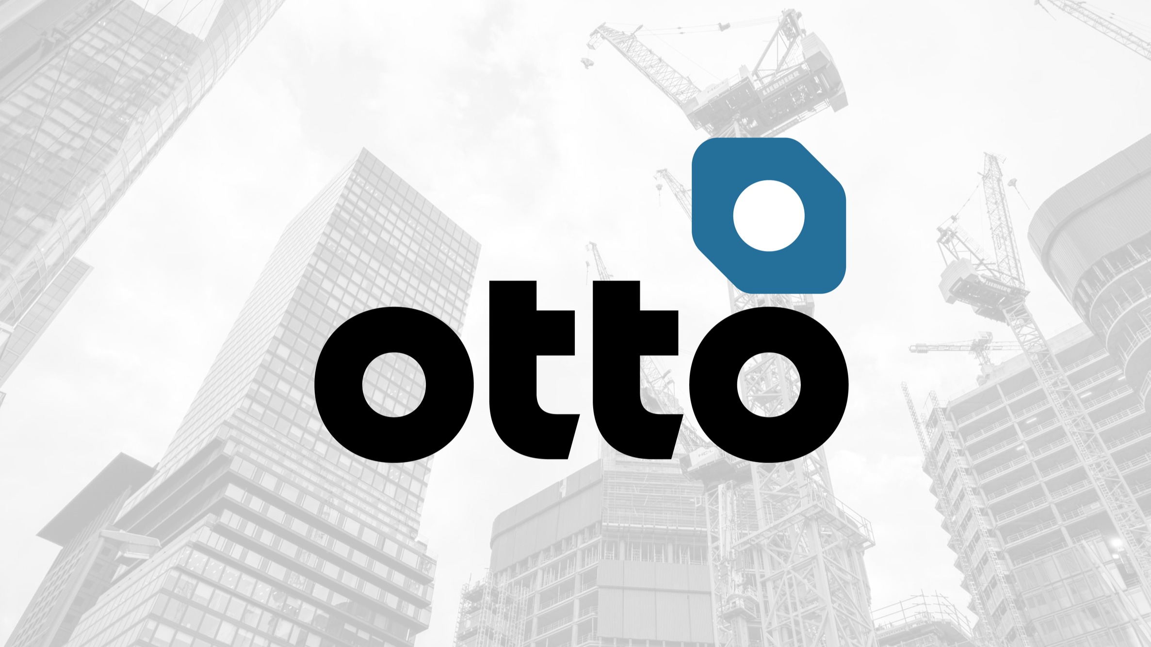
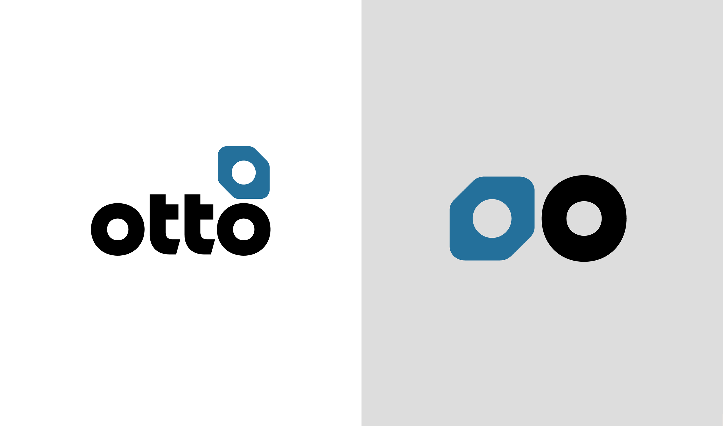
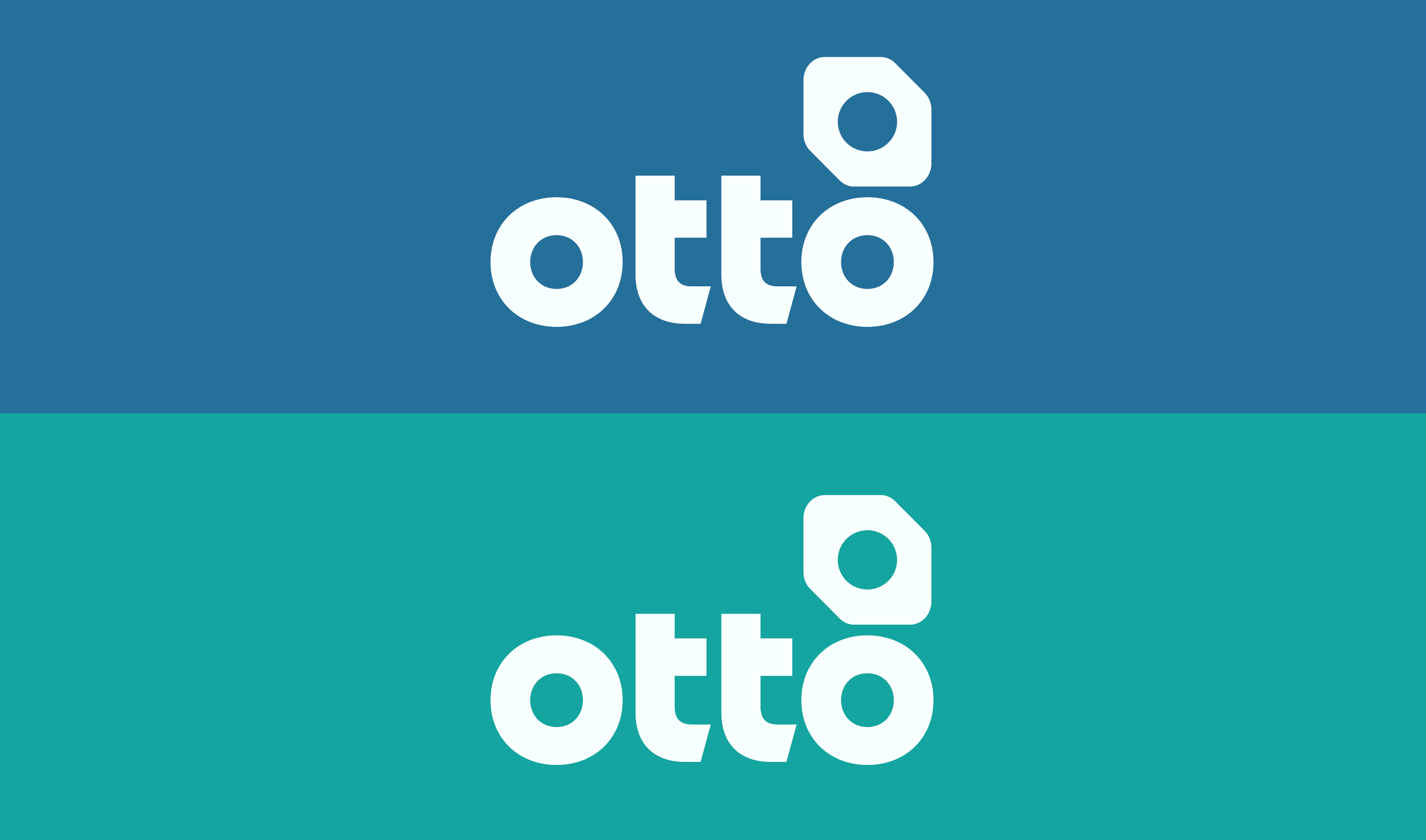
Otto Constuction
Logo Design
I collaborated with Otto Construction to develop a distinctive visual identity that reflects the core principles of their work. The logo draws inspiration from screws and bolts—fundamental components that hold structures together—symbolising strength, reliability, and precision. By abstracting these forms into a simple, modern mark, the identity communicates both the technical nature of the industry and a sense of cohesion and trust. The result is a bold yet minimal logo system that feels robust, recognisable, and aligned with Otto’s role in building and supporting solid foundations.